 Agencies
 Services
How to Author Components
What are Components?
- AEM components are used to hold, format, and render content made available on your webpages.
- Components can often be thought of as building blocks or bricks in building out your webpage.
- Many components will have preformatted features, such as font size and style, in order to maintain design consistency across the entire site experience.
- However, each component may have individual options and features that expand upon the functionality and user experience available. If there are any questions as to how components should be formatted, please see the style guide.
The Component Container
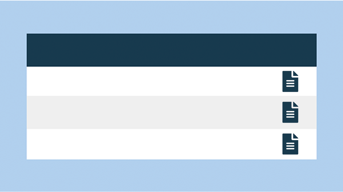
On any editable page, you will see a root container called "Drag components here" in which you can add various components to populate the page. Note: Make sure that your page is in Edit mode.

How to Add a Component from the Paragraph System
There are 2 ways to add a component from the paragraph system:
- click the "+" sign
- double-click the "Drag components here" box
Click the "+" Sign
Single click on "Drag components here" and you will see an "+" icon, which prompts a component list that you can select from.

Double-click "Drag components here"
Double-click on "Drag components here" and you will see an menu popping up, allowing you to select a component from the list.

Select a Component
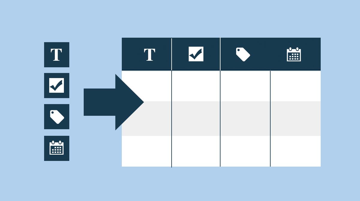
After either one of the processes above, you will see a component list. The component list is grouped into categories. Select the component you wish to insert.

Tip: In the event you know the name of the component, you can begin typing in its name and the component list will search for that component.

How to Add a Component from the Components Browser
Drag and Drop
An alternate to adding a component through the paragraphy system (above), is to open the side panel and drag and drop one of the options from the component library.

After a Component Has Been Placed
Once a component has been added, you can single click on the component to see the tool bar options.

From left to right, the toolbar options are*:
- Configure (wrench icon) - For configuring the properties of the selected component.
- Styles (brush icon) - For changing the styles/design of the selected component.
- Copy (copy icon) - For copying the selected component.
- Cut (scissors icon) - For copying the selected component but after the paste action will remove the original.
- Delete (recycle bin icon) - For deleting the selected component.
- Insert (add icon) - For adding a new component directly above the selected component.
- Paste (clipboard icon) - For pasting a copied component.
- Group (group icon) - For selecting a group of components so you can copy, cut, or delete them at once.
- Parent (table icon) - For selecting the parent component of the selected component.
- Convert (cabinet icon) - For converting one or more components into an experience fragment.
- Layout (double arrow icon) - For changing the layout or width of the seleced component.
*Note that some of these options are not available for certain components. To learn more about how to configure each component, check out the component pages.
Special Note on Layout Option
At times there may be a need to adjust the layout of a component, whether it is to adjust the component width or to accurately stack components atop each other.
This need often comes into play when a component needs to be adjusted for mobile devices.

In addition to editing components, you also have the option to edit the layout of these components on a page. Select "Layout" from the top right dropdown menu. Single click on any components you wish to change the size or layout for, and you will see 2 blue dots for you to drag left or right.
You will see the following tool bar options:
- Parent (table icon) - For selecting the parent component of the selected component.
- Float to new line (layers icon) - For floating the selected component to the next row/line.
- Hide (eye icon) - For hiding the selected component on the current view. This is useful if you wish to show a different component on desktop versus mobile.
- Handles for 2 Blue Dots - You can click and drag to the needed grid width.

To ensure your page looks good on mobile, use the emulator and switch to the one of the mobile devices (e.g. iPhone 8 Plus). You only have to edit the mobile view once because all mobile devices will inherit the same configurations.
Note that component configurations remain the same across devices while layout configurations do not. In other words, you can change the size or layout of components specifically for the mobile view. However, if you want to show a different component altogether for mobile, you would need to build a new component and use the "Hide" option to hide the desktop version (and vice versa for the desktop view).
Here is an example of image needing a width adjustment. By grabbing the Handles and dragging, the width can be adjusted to more accurately fit a mobile device.

The example after the width adjustment.

Moving a Component
There may be instances where, after placing a component, the component needs to be placed elsewhere.
To move a component:
Select the component to be moved with either tap-and-hold or click-and-hold.
Drag the component to the new location. AEM indicates where the component can be deposited. Drop it in your desired location.

Specific Components
Click a link below to get more details on specific components.
Navigation
Layout
Authoring
-
Accordion -
Audio -
Button -
Callout Box -
Carousel -
Dynamic Media -
Dynamic Media Revised -
Email Sharing -
Embed -
Experience Fragment -
External Audio -
External Video -
Form -
Icon Selector -
Image -
List -
List (v2) -
Live Audio/Video -
Map -
PDF Viewer -
Photo Gallery -
Print -
Search Bar -
Social Sharing -
Super Embed -
Tabs -
Text -
Text CTA -
Title -
Video